CLIENT: Unruly Coffee Company
PROJECT DETAILS: Branding (Name, Logo, Color Palette, Typography), Visual Design, Product Design.
No fluff. No rules. Just good f***ing coffee.
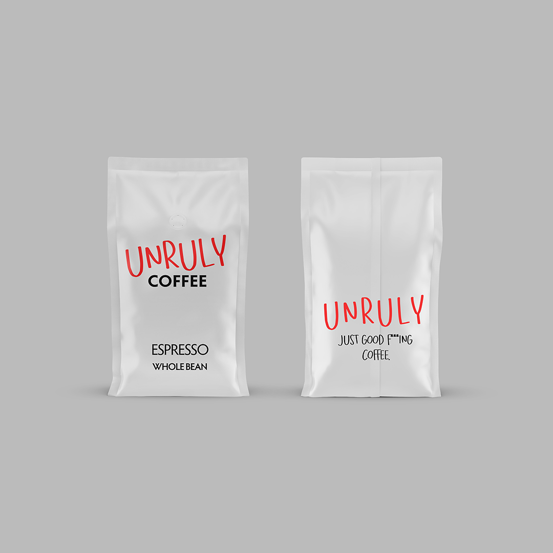
This one started with a short brief and a strong personality: “Create an edgy, in-your-face brand with no nonsense.” So we did exactly that — no mood boards, no safe bets. We named it Unruly Coffee Company, built a brand identity around raw expression, and created a visual tone that punches as hard as the first sip.
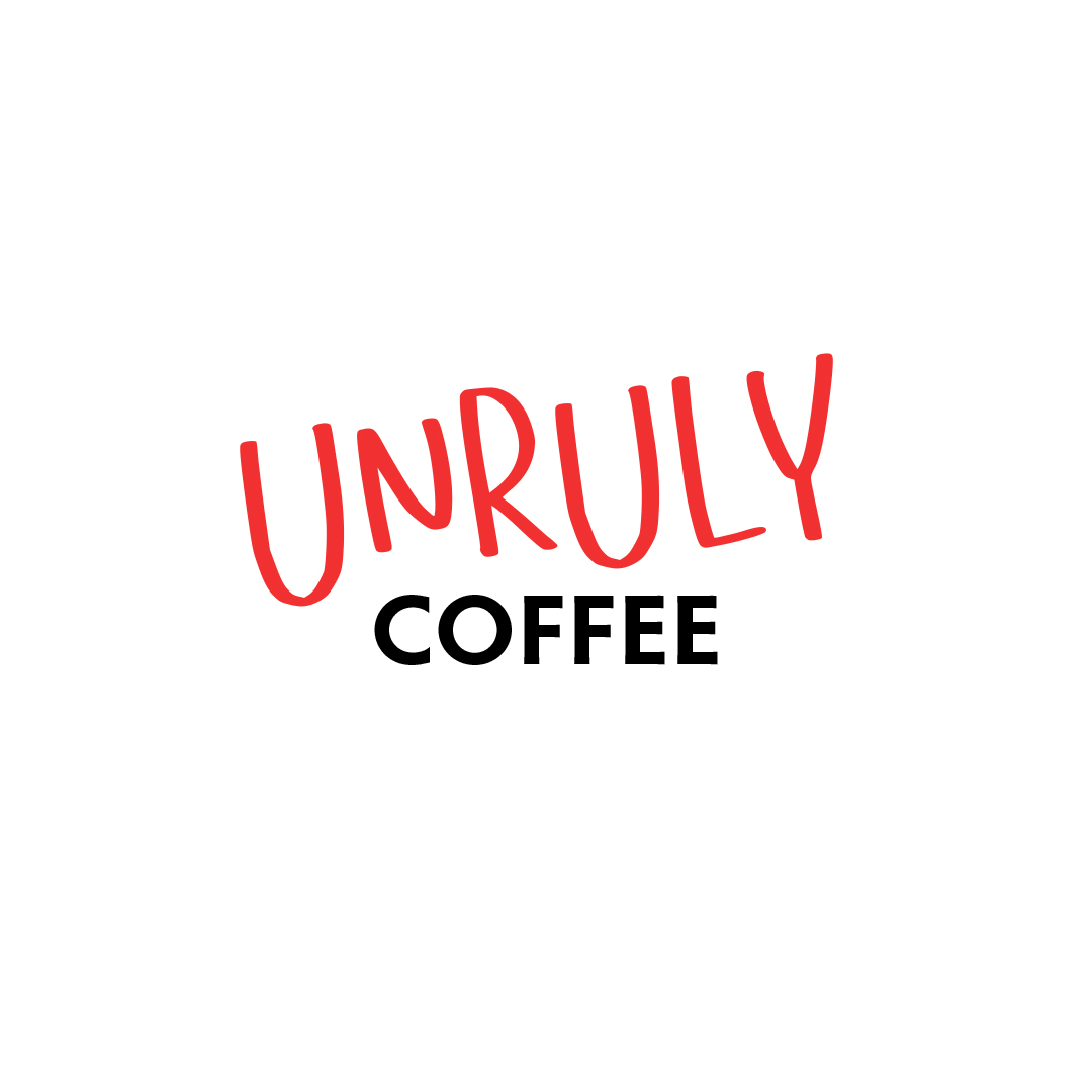
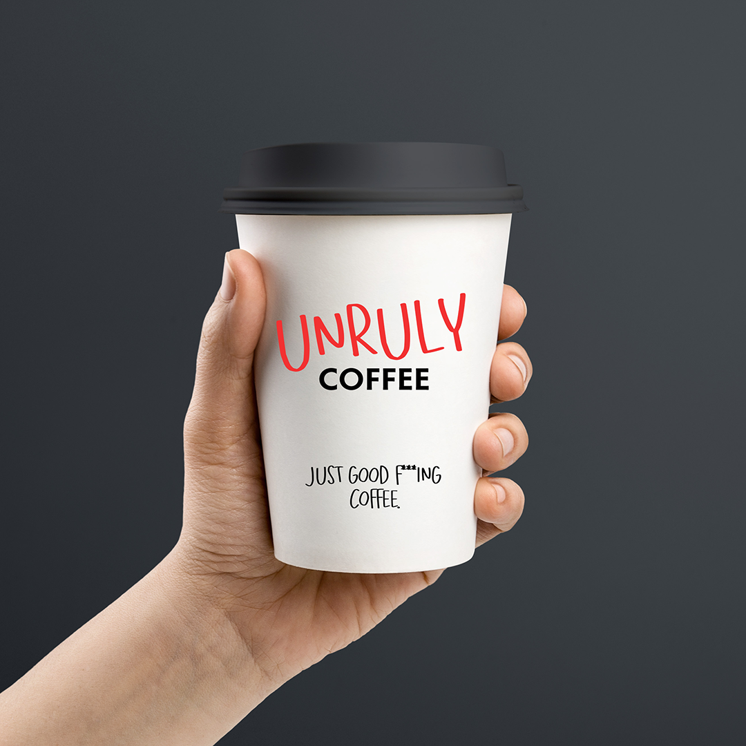
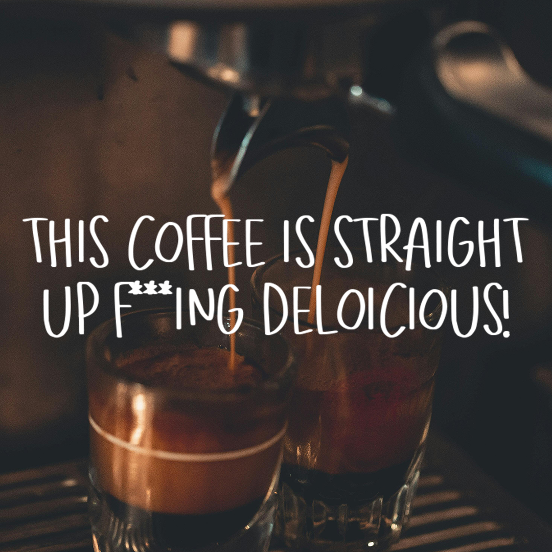
The logo is loud and simple — a handwritten “UNRULY” with attitude, anchored by a clean, secondary typeface for balance. Packaging followed suit: bold, stripped down, and built to stand out in a sea of beige craft coffee. Each roast (Dark, House, Espresso, Decaf) got its own minimal label, unified by tone and tension. Taglines like “Just Good F***ing Coffee” and “This Coffee Is Straight Up F***ing Delicious” said what the brand stood for — so we didn’t have to.

