FILE 002 / MARK / CLOSED
Bar Capital
Built for Wall Street. Branded for what's next.

01 / The Scene
A Wall Street firm with real credibility, real experience, and a brand doing none of it justice. Finance branding runs on a single instinct: look like the institutions that came before you, and trust will follow. Safe, muted, forgettable — the entire category dressed in the same navy suit. Bar Capital had earned its equity the hard way, and the brief carried a real constraint: reimagine the presence without erasing what had been earned. The easy move was a louder version of the same suit. The evidence argued against it.
02 / The Evidence
The investigation kept returning to two things the firm already owned. First, the way they actually operate: partnership over transaction, community over client lists, a culture that talks about raising the bar so habitually they'd stopped hearing themselves say it. Second, the name. A bar is a standard you raise. The ambition the category taught them to hide was sitting in their own letterhead, said out loud daily and expressed nowhere. They weren't built for the past of finance. They were built for what comes next, and the only place that wasn't visible was the brand.
03 / The Verdict
The firm had been stating its own ambition the whole time. The verdict made it the entire visual language.
04 / The Artifact
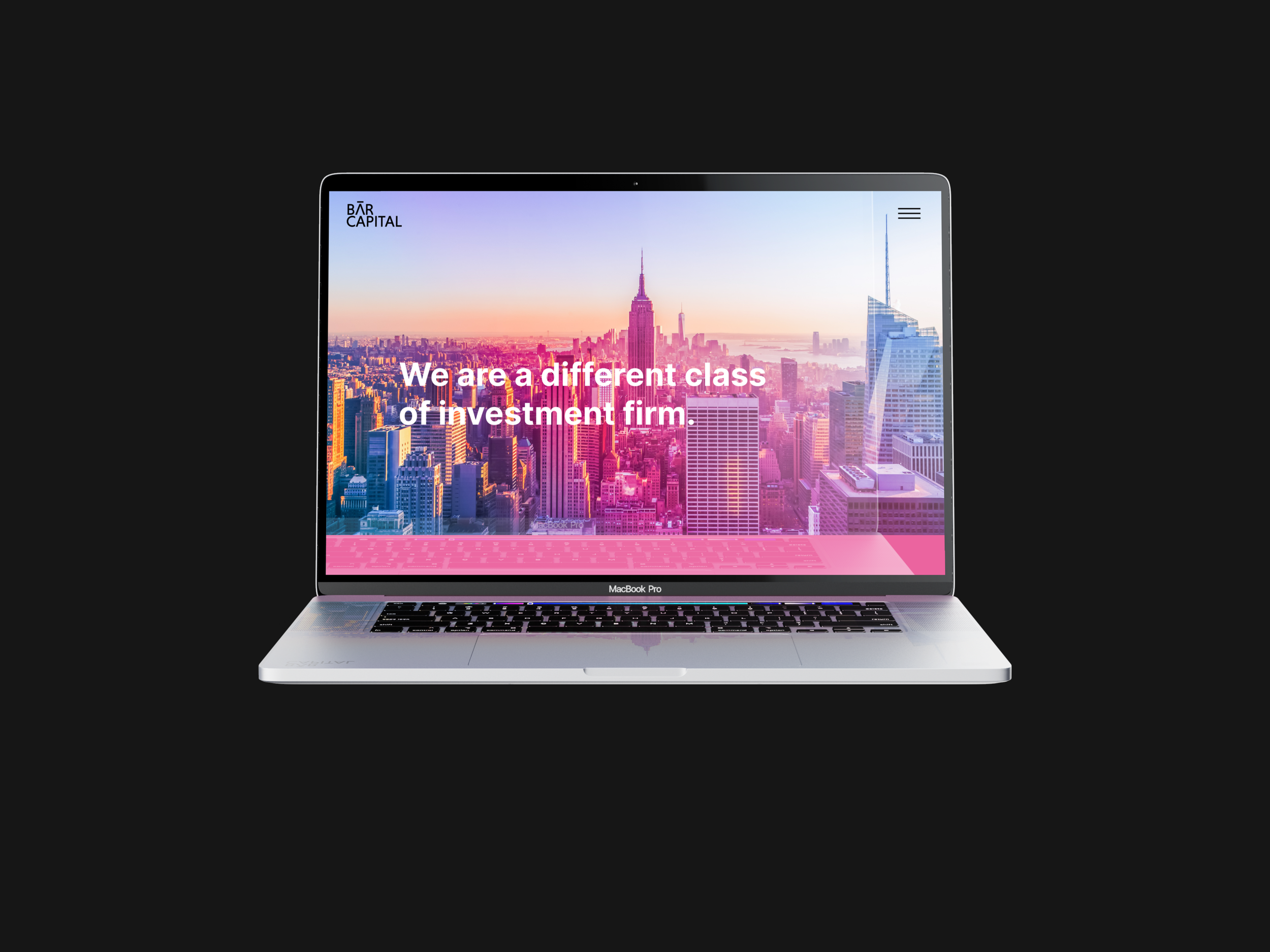
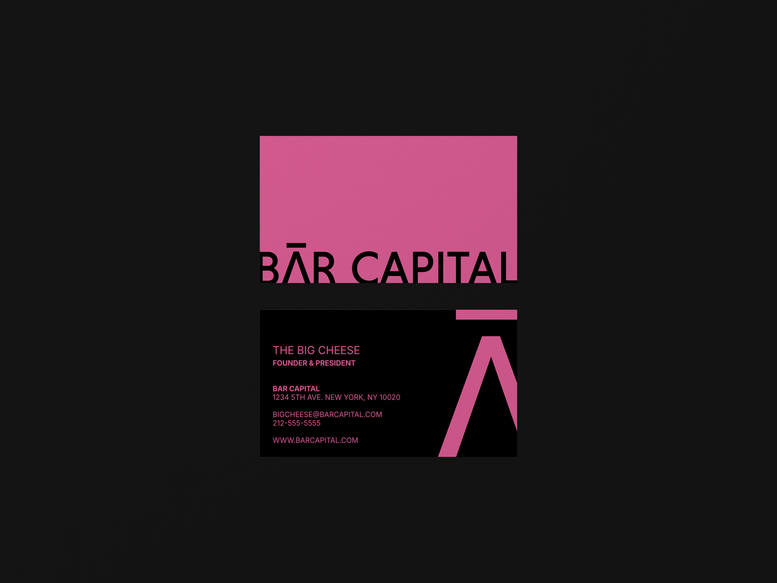
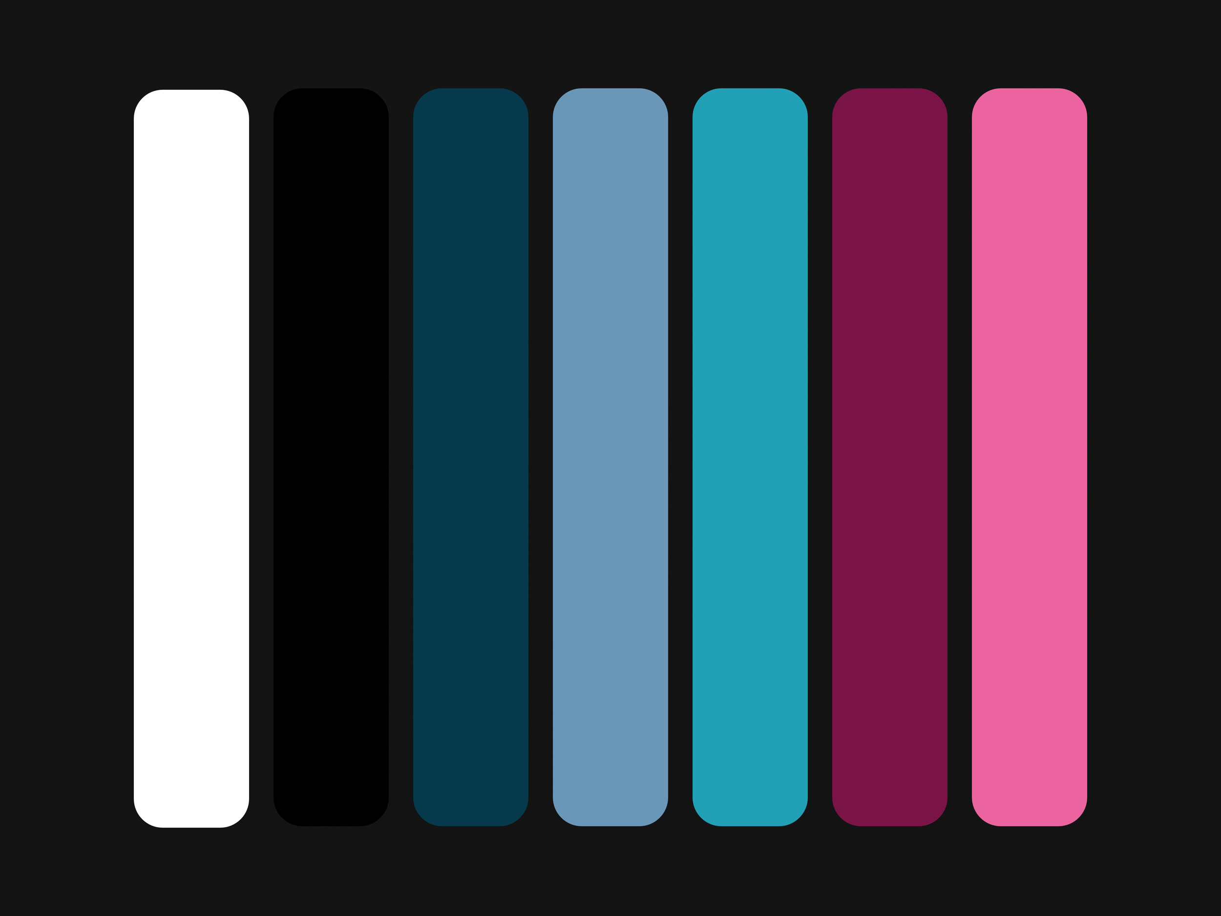
The identity system expresses forward motion without abandoning credibility. The redesigned wordmark and the A icon carry the raised bar literally: the standard, drawn into the letterform. The palette breaks from category navy into a modular system with cinematic range, referencing the visual language of near-future film without ever depending on it, and grounded in the energy of the city the firm actually works in. The website trades institutional distance for something brighter and more human, because a firm built on partnership shouldn't greet you like a vault. Nothing in the system is bold for boldness' sake; every departure from category convention traces to the finding that this firm's credibility comes from where it's going, not where the industry has been.
05 / The Chain
Read it backward. The site feels human because the firm runs on partnership. The palette breaks convention because the firm was built for what comes next. The icon carries a raised bar because the name was the evidence all along. The evidence produced the verdict, and the verdict governed everything that shipped. Nothing without a finding.
Case closed.